
Welcome to The Booknotes, a trusted academic platform and hub for comprehensive chapter-by-chapter book notes designed for Graduation, Post-Graduation, and competitive examination preparation including Semester’s Exams, UGC NET, CUET PG, and UPSC.
We cover a wide range of subjects such as History, Political Science, Geography, Sociology, Economics, Psychology, Philosophy, along with UPSC-recommended standard books. Our mission is to condense and simplify the learning experience by providing standard book-based notes, detailed explanations, practice questions, and solved Previous Year Questions (PYQs).
Whether you are a dedicated student, a passionate learner, or a focused competitive exam aspirant, our meticulously curated content helps you save valuable study time while building strong conceptual clarity. At thebooknotes.in, we bring together quality, structure, and convenience to support your academic and competitive success.

Hi, Myself Harshit Sharma. During my graduation at Banaras Hindu University (BHU), I noticed a common problem among university students — a lack of clear, exam-oriented study material. Notes were scattered, resources were excessive, and despite the abundance of content online, very little was actually aligned with university exam requirements. Knowing what to study often felt more difficult than studying itself.
To address this, I began approaching problems differently. While reading books, I focused on understanding it thoroughly and then converting that understanding into bulletin points. These notes were concise, concept-driven, and designed specifically for revision and exams. Over time, this method proved effective and became the foundation of a larger idea.
That idea led to the creation of The Book Notes. The vision is straightforward — to provide reliable, structured, and exam-ready learning resources that simplify complex theories. By combining clear explanations, relevant examples, key scholars, and flashcards, we aim to make preparation more focused and less stressful.
The Book Notes is built by students, for students, and continues to evolve with user feedback. It is not just a learning platform, but a commitment to clarity, consistency, and support throughout the academic journey.
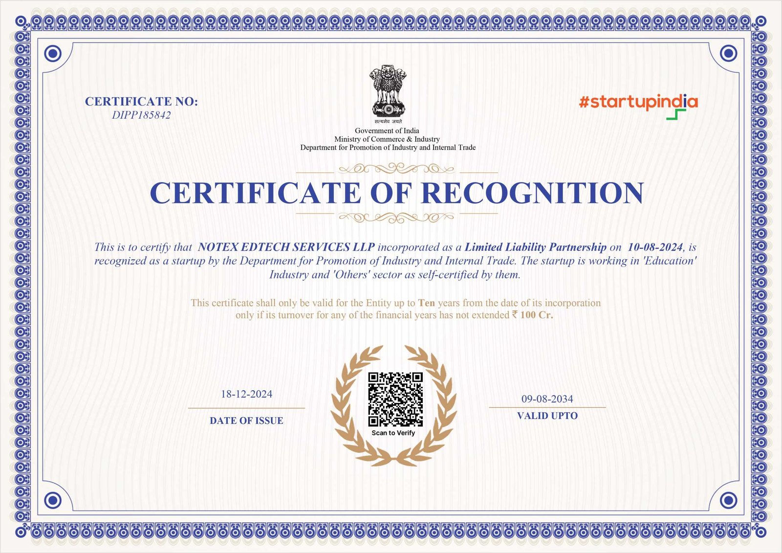
Recognised by the Government of India
Notex Edtech Services LLP, the company behind The Book Notes, is an officially registered and DPIIT-recognised startup under the Startup India initiative.