Statistical Methods
Introduction
Statistical methods form an indispensable analytical toolkit in modern geography, enabling geographers to systematically organize, summarize, analyze, and communicate the vast quantities of quantitative data — climatic records, population figures, agricultural output, socio-economic indicators — that characterize the discipline. The application of statistical techniques transformed geography from a largely descriptive discipline into a more rigorous, analytical, and scientific one, particularly from the mid-20th century onward with the rise of the “quantitative revolution” in geography.
Frequency Distribution
Meaning and Definition:
A frequency distribution is a systematic, tabular arrangement of raw (ungrouped) statistical data, showing how many times (the frequency) each value or range of values (a class interval) occurs within a given dataset. It is the essential first step in organizing raw, unordered data into a meaningful, interpretable form.
Key Terminology:
- Raw data: The original, unorganized set of individual observations/values as collected.
- Class interval: A specific range of values into which the raw data is grouped (e.g., 0–10, 10–20, 20–30), particularly necessary when dealing with continuous data or a large range of discrete values.
- Class limits: The lowest and highest values defining a class interval (lower class limit and upper class limit).
- Class width/class size: The numerical difference between the upper and lower boundaries of a class interval.
- Frequency: The number of observations/data points falling within a given class interval.
- Class mid-point/mid-value: The average of the lower and upper class limits, representing the class for purposes of further calculation (e.g., mean, standard deviation).
- Cumulative frequency: The running total of frequencies, accumulated progressively from the first class interval up to and including a given class — used particularly in constructing ogives (cumulative frequency curves) and in determining the median/quartiles graphically.
- Relative frequency: The frequency of a class expressed as a proportion or percentage of the total number of observations.
Steps in Constructing a Frequency Distribution:
- Determine the range of the raw data (the difference between the highest and lowest values).
- Decide the number of class intervals required (a commonly used practical guideline is Sturges’ Rule: \(k = 1 + 3.322 \log_{10} N\), where \(k\) is the approximate number of classes and \(N\) is the total number of observations), balancing the need for sufficient detail against excessive fragmentation.
- Determine class width, generally calculated by dividing the range by the desired number of classes, then rounding to a convenient value.
- Establish class limits/boundaries, ensuring intervals are mutually exclusive and exhaustive (every data value falls into exactly one class, with no overlaps or gaps).
- Tally the raw data into the appropriate class intervals, counting the frequency of observations falling within each.
- Present the completed frequency table, typically also including columns for cumulative frequency and/or relative frequency as needed for the intended analysis.
Types of Frequency Distribution:
- Discrete frequency distribution: Used for data that can only take specific, distinct values (e.g., number of children per household).
- Continuous (grouped) frequency distribution: Used for continuous data that can take any value within a range (e.g., rainfall amounts, temperature), requiring grouping into class intervals.
- Cumulative frequency distribution: Shows the running total of frequencies up to each class boundary, used to determine median, quartiles, and percentiles graphically.
Histograms
Meaning and Definition:
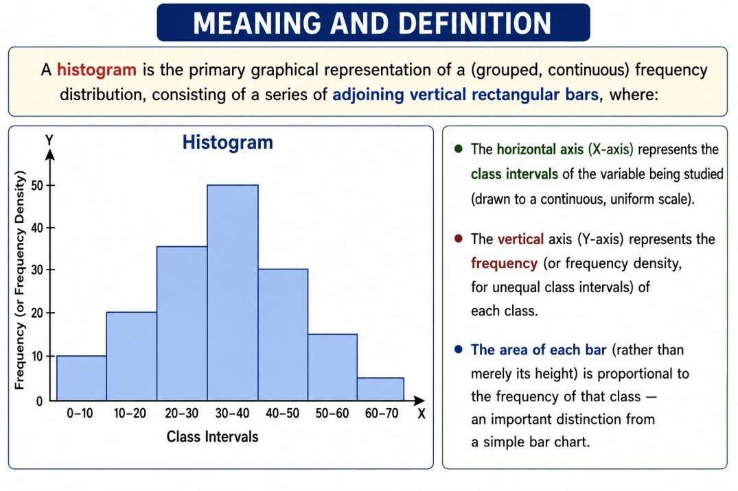
A histogram is the primary graphical representation of a (grouped, continuous) frequency distribution, consisting of a series of adjoining vertical rectangular bars, where:
- The horizontal axis (X-axis) represents the class intervals of the variable being studied (drawn to a continuous, uniform scale).
- The vertical axis (Y-axis) represents the frequency (or frequency density, for unequal class intervals) of each class.
- The area of each bar (rather than merely its height) is proportional to the frequency of that class — an important distinction from a simple bar chart.
Key Characteristics Distinguishing a Histogram from a Bar Diagram:
- In a histogram, since the underlying data (typically a continuous variable) has no natural gaps between categories, the bars are drawn touching/adjoining one another (no gaps between bars), unlike a bar chart, which represents discrete, unrelated categories and is conventionally drawn with gaps between bars.
- A histogram’s horizontal axis represents a continuous numerical scale (the class intervals of the variable), whereas a bar chart’s horizontal axis typically represents discrete, unordered categories (e.g., different crops, different countries).
Method of Construction:
- Class intervals of the frequency distribution are marked along the X-axis, drawn to a uniform, continuous scale.
- Frequencies are marked along the Y-axis, also to a uniform scale.
- For each class interval, a rectangular bar is drawn whose base corresponds to the class width (along the X-axis) and whose height corresponds to the class’s frequency.
- Special case — unequal class intervals: When class intervals are of unequal width, simply plotting frequency as bar height would misrepresent the data (since a wider class would appear disproportionately large); in this situation, the bar height must instead represent frequency density (frequency divided by class width), ensuring the area of each bar remains correctly proportional to its true frequency.
Interpretation and Uses:
- A histogram reveals the overall shape of the distribution — whether it is symmetrical, positively skewed (a longer tail extending toward higher values), or negatively skewed (a longer tail extending toward lower values) — and whether it shows a single peak (unimodal) or multiple peaks (bimodal/multimodal).
- Used extensively in geography to represent the distribution of climatic data (e.g., frequency distribution of daily/monthly temperature or rainfall values), population age structure (though age-sex data is more commonly shown via a population pyramid, a specialized double-histogram form), settlement size distribution, and similar continuous geographical variables.
- Provides a visual basis for further statistical calculation, such as graphically estimating the mode (via the histogram’s peak, using a specific graphical construction method involving diagonal lines drawn from the highest bar to its neighbouring bars).
Frequency Polygon and Frequency Curve:
Closely related to the histogram:
- A frequency polygon is constructed by plotting the frequency of each class against its mid-point, and joining these plotted points with straight lines (often drawn directly by connecting the midpoints of the tops of histogram bars, and typically closed by extending the line to zero frequency at the midpoint of an assumed class immediately before the first and after the last actual class).
- A frequency curve is a smoothed version of the frequency polygon, drawn as a smooth freehand curve rather than straight-line segments, useful for illustrating the general theoretical shape/trend of a distribution.
- An ogive (cumulative frequency curve) is constructed by plotting cumulative frequency against the upper class boundary of each class interval, producing a characteristic rising S-shaped (or “less than”/”more than” type) curve, used particularly for graphically determining the median, quartiles, and percentiles of a distribution.
Measures of Central Tendency
Meaning:
Measures of central tendency are statistical values that attempt to describe a dataset by identifying the single, central, or typical/representative value around which the data tends to cluster, providing a concise summary of an entire dataset through one representative figure.
Arithmetic Mean:
Definition: The arithmetic mean (average) is calculated by summing all the values in a dataset and dividing by the total number of observations.
For ungrouped data: $$\bar{X} = \frac{\sum X}{N}$$ where $\sum X$ is the sum of all observed values and $N$ is the total number of observations.
For grouped (frequency distribution) data: $$\bar{X} = \frac{\sum fX}{\sum f}$$ where $f$ is the frequency of each class, $X$ is the class mid-point, and $\sum f = N$ (total frequency).
Merits: Based on all values in the dataset (uses complete information); rigidly defined and mathematically tractable, capable of further algebraic treatment; most widely understood and used measure.
Limitations: Highly sensitive to extreme values (outliers), which can distort the mean and make it unrepresentative of the “typical” value, especially in skewed distributions; cannot be calculated for open-ended class intervals without an assumption of the interval’s true limits.
Median:
Definition: The median is the middle value of a dataset when all observations are arranged in ascending (or descending) order of magnitude — that is, the value that divides the dataset into two exactly equal halves.
For ungrouped data: If \(N\) is odd, the median is the value of the \(\left(\frac{N+1}{2}\right)^{th}\) item; if \(N\) is even, the median is the average of the \(\left(\frac{N}{2}\right)^{th}\) and \(\left(\frac{N}{2}+1\right)^{th}\) items.
For grouped data: $$\text{Median} = L + \left(\frac{\frac{N}{2} – cf}{f}\right) \times h$$ where \(L\) is the lower boundary of the median class, \(N\) is the total frequency, \(cf\) is the cumulative frequency of the class preceding the median class, $f$ is the frequency of the median class, and \(h\) is the class width.
Merits: Not affected by extreme values/outliers, making it a more robust and representative measure for skewed distributions; can be determined graphically from an ogive even when precise numerical data for all values is unavailable.
Limitations: Does not take into account the actual magnitude/value of all observations (only their rank order); less amenable to further algebraic/mathematical manipulation than the mean.
Mode:
Definition: The mode is the value (or class interval, in grouped data) that occurs with the greatest frequency in a dataset — i.e., the most common or “typical” value.
For grouped data: $$\text{Mode} = L + \left(\frac{f_1 – f_0}{2f_1 – f_0 – f_2}\right) \times h$$ where \(L\) is the lower boundary of the modal class, \(f_1\) is the frequency of the modal class, \(f_0\) is the frequency of the class preceding the modal class, \(f_2\) is the frequency of the class following the modal class, and \(h\) is the class width.
Merits: Represents the actual most frequently occurring, “typical” value; not distorted by extreme values; can be determined graphically from a histogram.
Limitations: A dataset may have no clear mode, or may be bimodal/multimodal (having two or more modes), making it ambiguous or less useful as a single representative summary value; less amenable to further mathematical treatment.
Relationship Between Mean, Median, and Mode
- In a perfectly symmetrical distribution, the mean, median, and mode all coincide at the same central value.
- In a moderately skewed distribution, the empirical relationship (developed by Karl Pearson) approximately holds: $$\text{Mode} = 3(\text{Median}) – 2(\text{Mean})$$
- In a positively skewed distribution (long tail toward higher values), the typical order is: Mode < Median < Mean.
- In a negatively skewed distribution (long tail toward lower values), the typical order is: Mean < Median < Mode.
Measures of Dispersion
Meaning and Significance:
While measures of central tendency identify a dataset’s typical central value, they say nothing about how spread out, variable, or consistent the underlying data is around that central value. Two datasets could have identical means yet be very differently distributed (one tightly clustered, the other widely scattered) — measures of dispersion (variability) address this by quantifying the degree of spread or scatter in a dataset.
Range:
Definition: The simplest measure of dispersion, calculated as the difference between the highest and lowest values in a dataset. $$\text{Range} = X_{max} – X_{min}$$
Merits: Extremely simple to calculate and understand.
Limitations: Based on only the two extreme values, ignoring the distribution of all values in between; highly sensitive to outliers; provides no information about the pattern of variability within the dataset.
Quartile Deviation (Interquartile Range):
Definition: Based on quartiles (values dividing the ordered dataset into four equal parts), the quartile deviation (semi-interquartile range) is calculated as: $$QD = \frac{Q_3 – Q_1}{2}$$ where \(Q_1\) (lower quartile) is the value below which 25% of observations fall, and \(Q_3\) (upper quartile) is the value below which 75% of observations fall.
Merits: Not affected by extreme values (since it is based on the middle 50% of the data, excluding the extreme upper and lower quarters); useful for skewed distributions.
Limitations: Ignores the values of the lowest 25% and highest 25% of the data entirely; not amenable to significant further algebraic treatment.
Mean Deviation (Average Deviation):
Definition: The arithmetic average of the absolute differences (ignoring sign, i.e., taking the modulus) between each individual value and a chosen central value (usually the mean or median) of the dataset. $$MD = \frac{\sum |X – \bar{X}|}{N}$$
Merits: Takes into account the value of every observation in the dataset (unlike range or quartile deviation); relatively simple to understand and interpret.
Limitations: The use of absolute values (ignoring the sign of deviations) makes it less amenable to further rigorous mathematical/algebraic treatment.
Standard Deviation and Variance:
Definition: The standard deviation is the most important, widely used, and mathematically robust measure of dispersion, defined as the square root of the average of the squared deviations of each value from the mean.
For ungrouped data: $$\sigma = \sqrt{\frac{\sum (X – \bar{X})^2}{N}}$$
For grouped data: $$\sigma = \sqrt{\frac{\sum f(X – \bar{X})^2}{\sum f}}$$
Variance is simply the square of the standard deviation (\(\sigma^2\)), representing the average of the squared deviations without taking the square root.
Merits: The most important, statistically robust, and widely used measure of dispersion, taking into account every value in the dataset; forms the essential foundation for a wide range of further, more advanced statistical techniques (correlation, regression, tests of significance, the normal distribution) that are extensively used in quantitative geographical analysis.
Limitations: More complex to calculate by hand than simpler measures (range, mean deviation); like the mean, it is somewhat sensitive to extreme values (since deviations are squared, giving proportionately greater weight to larger deviations/outliers).
Coefficient of Variation (CV):
Definition: A relative measure of dispersion, expressing the standard deviation as a percentage of the mean, allowing meaningful comparison of variability between two or more datasets that have different units of measurement or very different mean values. $$CV = \frac{\sigma}{\bar{X}} \times 100$$
Significance in Geography: Particularly useful for comparing, for example, the relative variability of rainfall between two different regions with very different average rainfall amounts (e.g., comparing rainfall variability/reliability in a low-rainfall arid region against a high-rainfall humid region) — since comparing raw standard deviation values alone would be misleading when the underlying means differ substantially. A higher coefficient of variation in rainfall is a key indicator of greater rainfall unreliability, a concept of significant importance in agricultural and drought-risk geography, particularly in the Indian context (e.g., comparing the high rainfall variability of Rajasthan against the low variability of the northeastern states).
Diagrammatic and Graphical Representation
Beyond frequency distributions and histograms, geography makes extensive use of a wide variety of diagrammatic techniques to visually communicate spatial and statistical patterns.
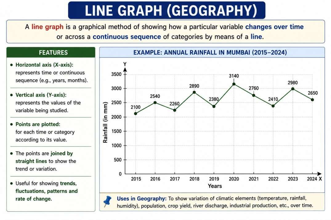
1. Line Graphs:
Used to show trends over time (temporal data) — e.g., a line graph plotting annual rainfall or temperature over successive years, or population growth over successive census decades — with time typically plotted on the X-axis and the variable of interest on the Y-axis.
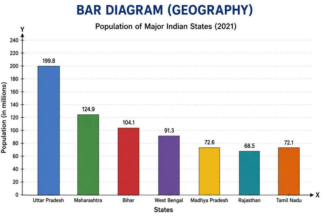
2. Bar Diagrams:
- Simple bar diagram: A single set of bars representing the magnitude of one variable across different categories (e.g., population of different states).
- Multiple bar diagram: Groups of bars, each group representing multiple variables for a single category (e.g., male and female literacy rates for different states), allowing direct visual comparison.
- Compound (sub-divided/stacked) bar diagram: Bars divided into segments representing the constituent components of a total (e.g., a single bar for each state’s total population, sub-divided into rural and urban components), showing both the total magnitude and its internal composition simultaneously.
- Percentage bar diagram: A special case of the compound bar diagram where all bars are drawn to the same total height (100%), showing only the relative proportional composition of each category, facilitating comparison of composition (rather than absolute magnitude) across categories.
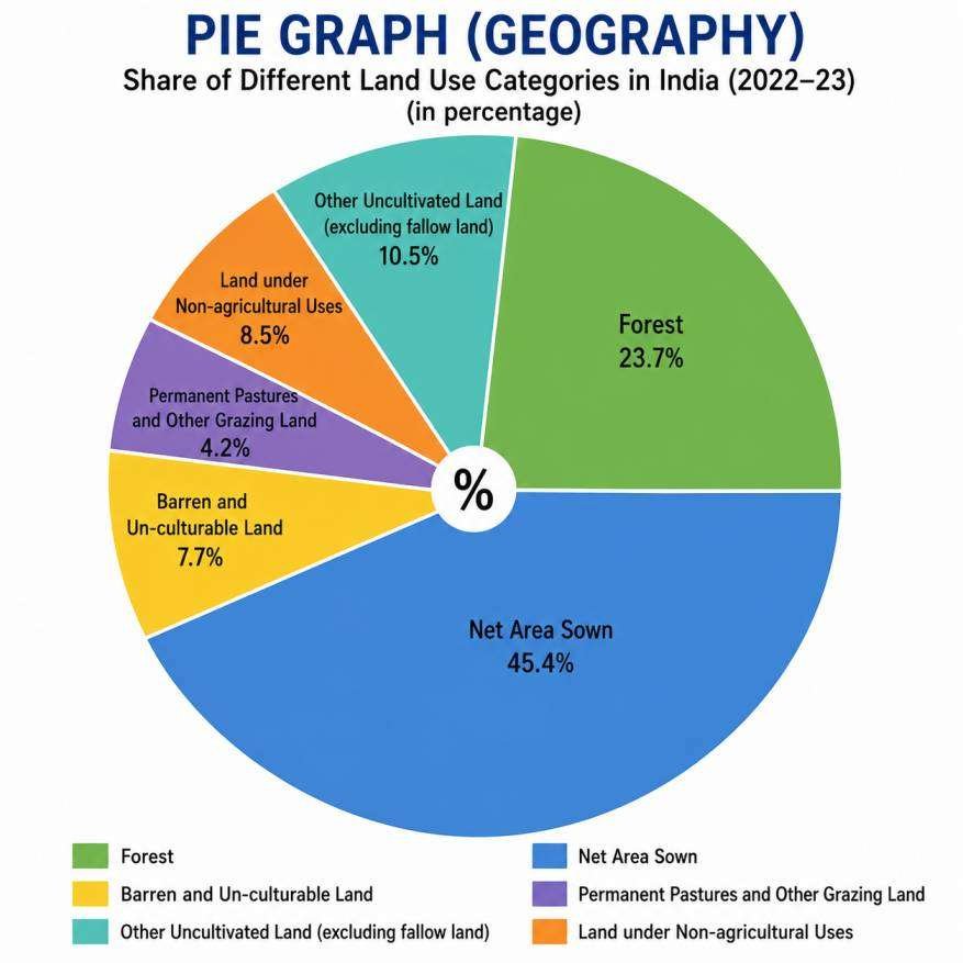
3. Pie Diagrams (Pie Charts):
A circular diagram divided into sectors, where the angular size of each sector is proportional to the value/percentage it represents of the total (a full circle = 360° = 100% of the total). Widely used in geography to show the proportional composition of a variable — e.g., the sectoral composition of a country’s GDP (agriculture, industry, services), or the composition of India’s population by religion or by occupational category.